Rapidevsol rebrand
Rebranding our own studio
A new logo, a 25-page brand system and this website, designed to position Rapidevsol as a premium AI-powered studio for clients in the US, UK, Gulf and Pakistan.
- Client
- Rapidevsol (in-house)
- Industry
- Digital studio
Remote, working worldwide - Services
- Logo, Brand system, Stationery, Website
- Status
- Completed, 2026
The challenge
The old RAPDEV wordmark looked like a small local software shop. To win clients in the US, UK and Gulf, the studio needed an identity that feels premium and serious, works as well for code as for creative work, and reflects how we actually work: AI for speed, people for judgment.
01 · The mark
Three blocks, one forward step
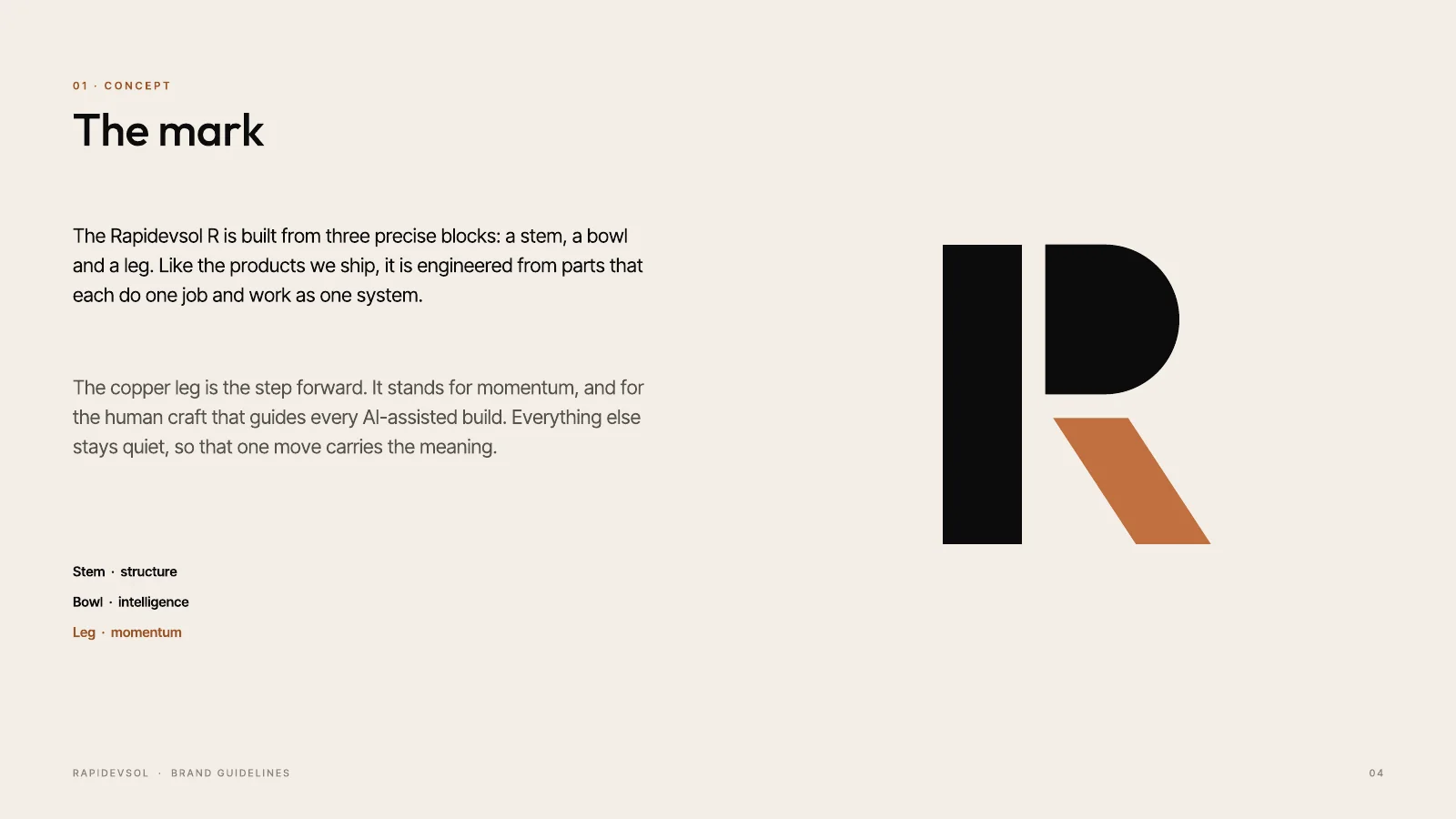
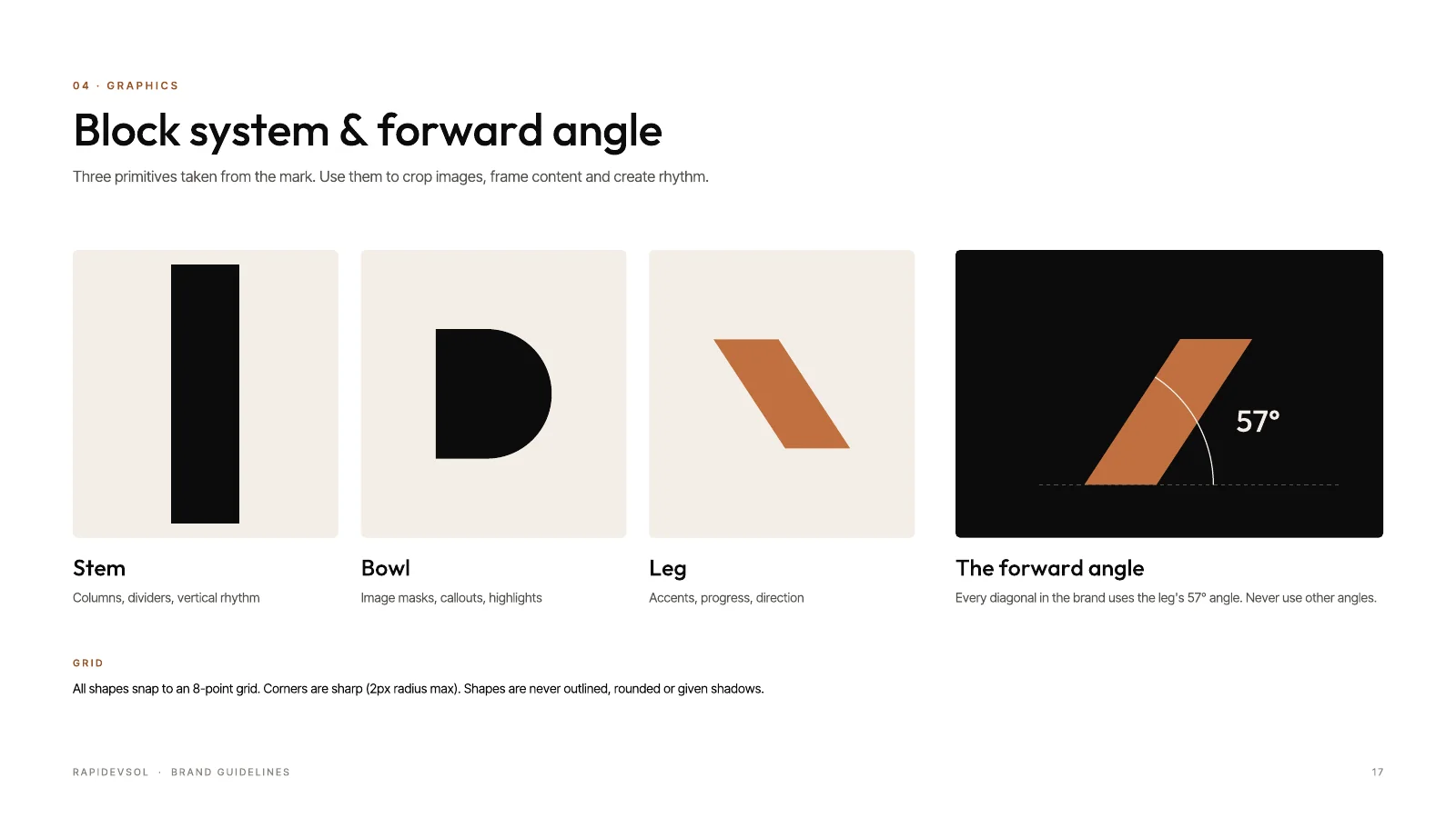
We explored six concepts over two rounds before choosing the Modular R. It is built from three blocks: a stem for structure, a bowl for intelligence and a copper leg for momentum, the one forward step. Like our work, it is engineered from parts that each do one job.
02 · Colour & system
A quiet palette with one confident accent
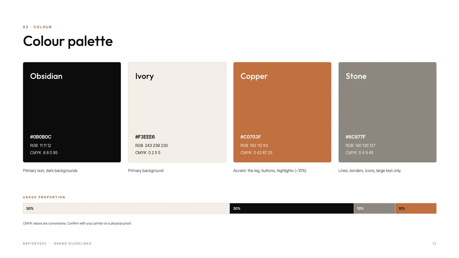
Obsidian and ivory carry the brand; copper appears in roughly ten percent of any layout, so it always means something. Every diagonal in the system follows the leg’s 57° angle, and the stem, bowl and leg double as graphic elements.
03 · Applications
From business card to website
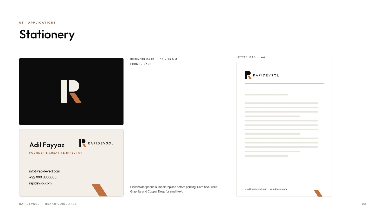
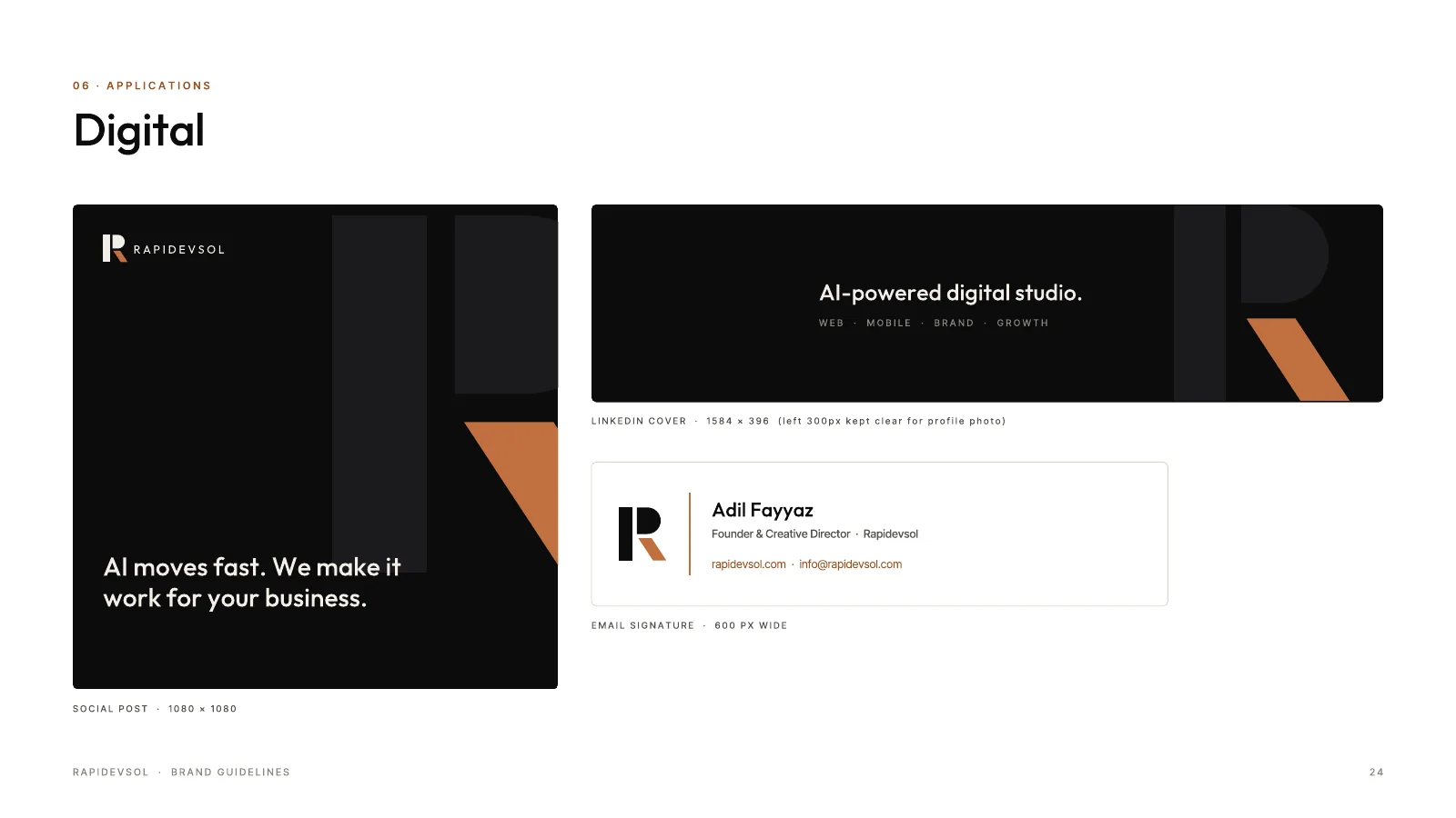
The 25-page guidelines cover voice, logo, colour, type, graphic elements, a website UI kit, stationery and digital templates. This website is built directly from that UI kit.
Outcome
What we delivered
Deliverables
- Logo concepts (2 rounds)
- Final logo pack
- 25-page brand guidelines
- Website UI kit
- Stationery
- Social and digital templates
- Website design and build
Want results like these?
Tell us what you're building. We'll reply within one business day.